We come across banner ads everywhere, so much so that they have become intrinsically linked with our web experience. Banner ads clicks may be dropping but we can’t afford to ignore the power of this prolific online advertising format in spreading the brand message to a large audience. Just seeing a web banner ad creates recall and user preference for that product or service. But our senses get assaulted every day with some really obnoxious examples of banner ad designs so it is time to turn the tide. Greenhouse Designs Group would like to arm you with some basic design guidelines so that you can create web banners that will make a favorable impression and bring in clicks.
Apply Standard Sizes for banner ads
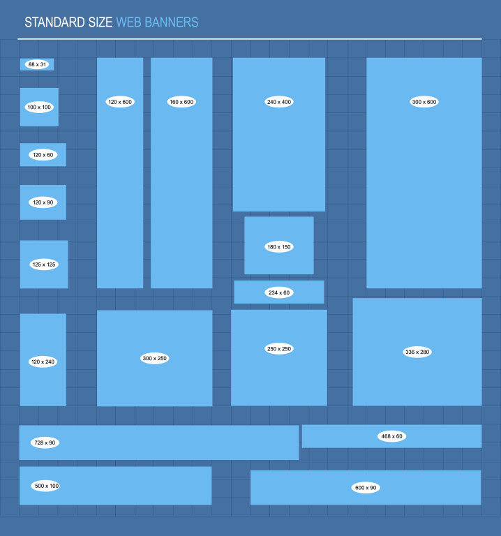
Banner ads work within the specs of the site where you plan to advertise. And since most sites use a set of common sizes, it is advisable to design in the size you will use the most. Google AdWords, lists the most popular standard banner ad sizes on the web as –
- 728 by 90 pixels for leaderboard at the tops or bottoms of pages
- 300 by 250 pixels medium rectangle, either embedded in text elements or floating on the right
- 336 by 280 pixels large rectangle
- 300 by 600 pixels half page
- 320 by 100 pixels mobile banner
You can take elements from the design in your most preferred banner size and reflect it in other sizes too. When you don’t take the time to resize or recreate your ad specific to the networks specs, your creatives become distorted and displeasing to the eyes of your target market. Check out the banner ad for FatCow to see how your layout can work for a number of different banner sizes.

Create Hierarchy
All banner ads need to have a brand logo, clear message within 2-10 words about your offer (High quality, Free Signup, Limited Time Only) and encouragement to click (Watch Now, Click Here, etc). The real challenge lies in the fact that there is not much room to do this so there has to be a right balance between these elements. Create a simple hierarchy of elements using size, space and color to draw attention to each.

This banner ad from JumpCloud showcases the company logo first, followed by the value proposition which calls attention to itself and the CTA button is smartly placed right at the bottom inviting clicks.
Pair Stylistic Typography With Images
Banner ads only have small spaces to play around with so make the most of it by using strong, easy to read typefaces with striking images. Make sure to use tight images and detail shots as there is a lot of competition for eyeballs. This banner ad by Cavender’s pairs playful text, handwritten type and great photography to effectively announce the brand and product.

Use Colors And Texture Appropriately
Color is generally the first thing we notice in banner ads. Different colors have distinct associations, and your choice of color will depend on the kind of emotions you want to evoke in your audience. Look up this great resource on color theory to know how best to use color in ads. Banner ads do not always have to be subtle so feel free to use contrasting and bold colors to draw the eye in. In this banner ad, the bright yellow rectangle ties in with the National Geographic logo and is highlighted even more against a black or blue background. The yellow CTA reinforces the brand and also invites quick action.

Incorporating texture within a banner ad can also create interesting dimensions, movement and depth to drive home the brand image. Check out the unique geometric polygon pattern in the limes of this ad for Corona by Vasiliy Yusov. The angularity of the fruit adds in dimension and edge to the product being advertised that you just wouldn’t get from a simple image or illustration.
Incorporate Stylized Illustration
Adding in illustration to your web banner ads can be simple or detailed depending on the message you are trying to deliver. Illustration can often speak volumes, especially if you add in animation to it. Illustration can be edgy and modern or fun and playful. Adidas ran a Line Runner sidebar ad campaign where the viewer was provided a black pen and prompted to draw a line which became a course for the runner with trees, buildings, hills, lamp posts popping up for an interactive digital adventure.

Focus On The Product
The ultimate goal of an ad is to sell so it helps to shine the light on the product. Tell your story using the product. Ikea is known for its space-conscious furniture and it highlighted this point by making the most of banner ad real estate too. Hovering over the ad would bring a product into focus and a click would send the person to the site to purchase.
Better Banners
Banner ad placements can certainly help users connect with your brand. And following some of these design guidelines will definitely improve your click-through rate and help you achieve your campaign goals.
